How we got here
I was in a meeting recently about how alt text should be written in an online shop I was consulting for. I was there as an external consultant for software architecture, alongside someone from internal IT and two people from marketing.
By the end of the meeting, the decision was clear: the existing approach would stay. Alt text would continue to be treated as another place for keywords, not primarily as a tool for accessibility.
That meeting was frustrating, but the bigger issue is that accessibility often has no clear owner in a company. When nobody is responsible for it, it becomes negotiable. And when it becomes negotiable, it usually loses.
In smaller companies, I think marketing is often in a good position to take accessibility seriously. Their job is to help people understand, trust, and use what the company offers. That should include as many people as possible, not only the ones who experience the web in the same way the team does.
Excluding disabled people is discrimination. It also harms the business by excluding a large user group.
With that rant out of the way, let’s talk about how to do it right.
What is accessibility?
Accessibility is the design of products, devices, services, vehicles, or environments to be usable by disabled people. 1
I focus on accessibility in software for this article. I will also talk mostly in web development language because that’s what most people use. The same applies for native apps.
SEO is a scam
SEO stands for Search Engine Optimization. That name is the problem.
Don’t get me wrong. Making your website crawlable for search engines is important. But that’s where SEO ends.
SEO confuses correlation with causation.
Useful, clear, fast, accessible pages always rank better because search engines try to approximate usefulness. Focus on the experience of real users, not an algorithm. Just give your users a good experience and search engines will value that.
Even if you want to outsmart search engines, you cannot do that. You cannot optimize for a system you cannot inspect, control, or predict. Google does not publish its ranking rules. It also changes them over time.
So when someone says “optimize for Google,” ask: Optimize for what, exactly? They do not know.
They know guesses. They know patterns. They know what used to work. That is not the same as knowing the algorithm.
Make the page clear. Make it accessible. Answer the query. Help the user. That is the only “SEO” that makes sense.
Everything else is guessing. Or advertising.
If you want to invest money into a high Google ranking, pay Google, not some SEO guru.
Alternative texts
Visual context
Some primary visual content is difficult or impossible for some disabled people to consume. For simplicity, let’s go with images as an example but the same applies to diagrams and other purely graphical content.
The alternative text (alt text in short) is for people who cannot consume this content visually for whatever reason. It is not an image description or a subtitle. The responsibility of alternative text is to fill the gap. It should take the context of the page and add the information that the graphical content would give, in a textual way.
So, how to write a good alternative text? Consider the information you are already given by the text on the UI. Then think about what additional information the image is giving you that would be missing if you can’t see it. The critical detail is that you should avoid repeating information that is already present in text on the UI. Only include information that is relevant for how the image is used.
Take this image for example:

If you use this image on a page about cycling, you can write:
Man rides a bike through quiet town street
The shop does not matter here. It does not add any information that is relevant in that context.
If you use the same image on a page about that coffee shop, the biker becomes irrelevant:
Coffee shop in a red-brick building with large windows, a red awning, and a sign reading ‘Stads Koffie Branderij’
Think about the context. What is the page about? What information should be added if the image is not viewable?
The alt text should just add the information that is missing if the image is not viewable and nothing more.
Emotion
Let’s say you have a page of speakers for a conference. The speaker list has the name, company, and a photo of the speaker.
What do you write in the alt text? Repeating the name of the speaker makes no sense.
Do you try to describe the speaker? Gender? Ethnicity? That gets weird fast.
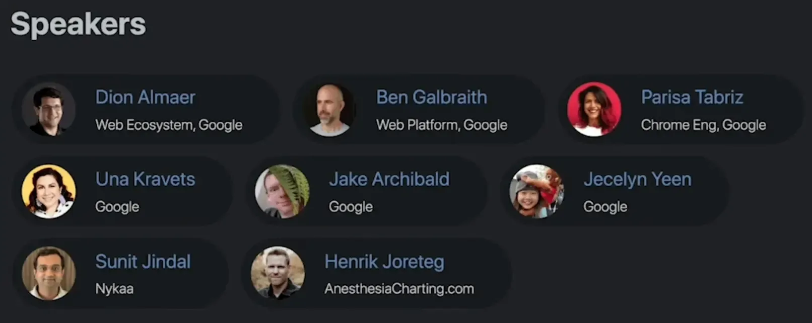
Let’s focus on that one entry and let’s say it is a tech conference.

The name “Jake Archibald” and the company “Google” are already clear in text. For a tech conference, his ethnicity, gender, age, and glasses are irrelevant. With context alone we don’t get far here so let’s focus on the emotion.
Jake Archibald cheekily hiding behind a plant
Other speakers might just have a headshot without anything worth mentioning. That’s fine. Just leave the alt attribute empty.
The example for the conference is from HTTP 203 podcast by Jake Archibald and Surma episode about alt text.2 I can recommend watching it.
If this conference wasn’t about tech but discrimination, what is important suddenly changes. Information like ethnicity and gender now become meaningful. What is relevant and what isn’t heavily depends on the context.
Product photos
On a shop page, it is common to have multiple photos of the same product. This is very unique.
To get the obvious out of the way: don’t include the product name or generic description in the alt text. That would be repeated information. Remember that a screen reader user would have to listen to that over and over again.
Just like before, only write the information that this image gives you that is not already in the text on the UI. But additionally, we have multiple images. You can’t just write the alt text of every image in isolation. You have to consider the other images.
 This image shows the PC in a 45 degree view. It shows the air intake on the front and the air exhaust on the top.
You should not repeat that it is a PC or what its specs are.
This image shows the PC in a 45 degree view. It shows the air intake on the front and the air exhaust on the top.
You should not repeat that it is a PC or what its specs are.
 This image shows the glass window through which the PC components are visible.
You should not repeat the visible components as they should be listed in a technical specifications table or something similar.
The glass window is important as it might be a new information.
This image shows the glass window through which the PC components are visible.
You should not repeat the visible components as they should be listed in a technical specifications table or something similar.
The glass window is important as it might be a new information.
 This image shows the back of the PC where its ports are visible.
The ports of a PC are important.
You can repeat them here or go into the detail about their position and alignment but it’s not required and depends on the usual type of customer and the level of detail in your technical specifications.
This image shows the back of the PC where its ports are visible.
The ports of a PC are important.
You can repeat them here or go into the detail about their position and alignment but it’s not required and depends on the usual type of customer and the level of detail in your technical specifications.
No additional information
There are images that don’t need any additional textual information.
Some images are purely decorative, like icons  .
.
Never remove the alt attribute. Always include it.
You can set it to an empty string if there is no meaningful text you could write.
An empty alt attribute is not the same as no alt attribute at all. It says that you thought about it and decided not to write any text.
For some images, there is no text you could write that adds any meaningful information.
UI scaling
Imagine you have difficulty reading, so you increase or decrease the font size. The reasons can be very different, from blurry vision to very high pixel density screens.
But then you encounter UI elements so spacious that there is hardly enough room for the text.
This happens on most websites because it became best practice to use the CSS units rem (relative to root/global font size) and em (relative to local font size) not only for text, but also for spacing, sizing, and layout
I do understand that it makes UI sizing easier if spacing and container sizes are based on font size but the downside is that it makes many UIs unusable if the font size changes.
Even TailwindCSS, the most used styling framework on the web, uses --spacing: 0.25rem; as the default spacing unit.
This is not a problem of what is the correct unit. I don’t care what units you use as long as the UI scales correctly.
The problem is accidental coupling between the font size and whitespace.
If you use rem for things like padding, and the user increases the font size, that also increases the padding.
The problem is that this takes space away from the text that just got bigger.
You see the problem now? Bigger text + less room for text = unreadable text / unusable UI.
In the following example, the slider changes the root font size (rem). The first card uses 0.25rem as its spacing unit. The second card uses 4px as its spacing unit. At a root font size of 16px they are identical because the default font size is 16px, so 1rem equals 16px.
Just play around with it and judge for yourself.
Please do not use rem or em as the default unit for spacing and layout. Use font-relative units only where scaling with text is intentional. For TailwindCSS, set @theme { --spacing: 4px; } in your config 3. This keeps Tailwind’s spacing proportions intact, but spacing stays fixed when the root font size changes. Then explicitly use for example w-[8rem] where needed.
You do have to think more carefully about units when doing this. Some values should still scale with font size. But that should be an explicit design decision, not the default behavior of every margin, padding, gap, width, and height.
You can use the <meta name="text-scale" content="scale"> tag to tell browsers that your website is actually capable of scaling the text correctly.4 Otherwise the behavior is very platform-specific (mobile does not scale at all without this).
At the time of writing this, Chromium-based browsers are the only ones that support this meta tag.
Check caniuse.com for the latest information.
Support on Chromium-based browsers means support for the majority of users.
Keyboard navigation
Try to use your UI without a mouse.
Not as a quick test where you already know where everything is. Really use it. Open the page, put the mouse away, and try to reach the thing a user came for.
You will notice very quickly how much of the interface is just in the way.
This is especially bad on shop sites. Before the actual content, there is often a logo, a search bar, language selection, account menu, wishlist, cart, category navigation, promotional links, and maybe another navigation below that.
A keyboard user should not have to tab through all of that on every page. Add a “jump to main content” link. It can be visually hidden until focused, but it must exist. It gives the user a way to skip the noise.
The order of elements matters a lot. A screen reader does not know that something is above, below, left, or right in the same way a visual user does. The user moves through a sequence. If that sequence is wrong, the UI becomes confusing.
This also means that visual order and accessibility order are not always the same thing. Moving elements with CSS does not change how a screen reader reads them. The same is true for graphical tricks, shaders, or other visual transformations. That can be a problem, but it can also be useful. Sometimes the best visual order is not the best reading order.
Errors need the same care. If a form field has an error, the message must be clearly linked to the source of the error. Not only with a red border. Not only by placing text somewhere nearby. The user needs to understand which field caused the problem and what has to be fixed.
Browsers have good built-in tools for this. You just have to use them.
Some things should not be read at all. Decorative icons, layout helpers, and cosmetic effects can make a screen reader experience worse if they are exposed as content. Hide them from the accessibility tree when they do not add information.
The best way to understand this is to learn basic screen reader usage and try your own UI with it. Not perfectly. Just enough to navigate, read, jump between headings, interact with forms, and notice when the experience breaks.
You will find problems that no checklist would have made you feel.
Color
We have a baseline that can be verified by tools like Google Lighthouse that check for color contrast. This is what you show on default settings. But there is more than that.
Some people need higher contrast. Some people need lower contrast.
That sounds contradictory, but it really is not. Eyes are different. Screens are different. Rooms are different. Some people need strong edges to understand the interface. Others get tired or even strained when every edge screams at them.
So please do not treat contrast as one perfect number.
If the user asks for more contrast, give them a calmer interface with clearer separation. Not just darker text. Remove background textures. Remove decorative gradients. Remove low-value shadows. Make borders, focus states, and interactive elements obvious.
If the user asks for less contrast, do not just make everything grey and unreadable. Reduce the aggression. Soften the theme colors. Keep the structure. Keep the hierarchy. The interface should feel quieter.
CSS is getting good enough for this. With relative color syntax, you can derive softer or stronger colors from your existing theme colors instead of maintaining a completely separate palette for every preference. That is exactly the kind of thing we should use CSS for.
I would be careful with contrast filters or shaders. They can be useful as an emergency layer, but they are not design. They can destroy brand colors, make images weird, and turn carefully chosen UI states into mud. No filter understands color relation and perception. If you have control over the components, change the theme. Do not paint over the whole page and hope it feels good.
There is also forced color mode.
In that mode, the browser and operating system take much more control over colors. Your beautiful theme is no longer the source of truth. The user is.
That is good.
But it also means you have to test it. Some things disappear. Shadows may stop working. Background images may become noise. Subtle borders may no longer exist.
Use the forced-colors media query for that. Hide decorative background images. Remove noisy visual effects. Add real borders where you previously relied on shadows or color alone.
@media (forced-colors: active) {
  .hero {
    background-image: none;
  }

  .card {
    box-shadow: none;
    border: 1px solid CanvasText;
  }
}
The goal is not to preserve your design at all costs.
The goal is that the user feels like the interface respects their eyes.
Motion
If you insist on torturing your users with scroll hijacking, software cursors, or moving backgrounds, at least turn them off when the user has prefers-reduced-motion set to reduce.
In most cases, this works well enough:
@media (prefers-reduced-motion: reduce) {
    * {
        scroll-behavior: auto !important;
        transition-duration: 0s !important;
        animation-duration: 0s !important;
    }
}
Or you move your animations inside of @media (prefers-reduced-motion: no-preference).
If your setup is more complex than that, please invest the time to disable all animations if the user prefers that.
The dark side of the web
Many users prefer dark mode. Many prefer light mode. Some even wage intellectual wars over which is better. Do not participate in that war and let your users choose.
I have seen so many websites and apps that support light, dark, and automatic mode but default to light mode. Why? If you already have a setting where the system preference is respected, use that as the default and spare your users the one or two clicks it takes to change the theme.
Thank you for reading
Accessibility can be intimidating if you don’t depend on it. But once you get the hang of it, it is actually not that hard to include basic accessibility into your UI.
If you are unsure, ask people who use those accessibility tools. They are usually happy if someone cares.
Footnotes
-
S. L. Henry, S. Abou-Zahra, and J. Brewer, “The Role of Accessibility in a Universal Web,” in Proceedings of the 11th Web for All Conference (W4A ‘14), 2014, Art. no. 17. ISBN: 978-1-4503-2651-3. ↩
-
Chrome for Developers, “Writing Good Alt Text - HTTP 203,” YouTube, Mar. 2, 2021. [Online]. Available: https://youtu.be/flf2vS0IoRs. [Accessed: May 28, 2026]. ↩ ↩2 ↩3
-
Tailwind Labs, “Padding: Customizing your theme,” Tailwind CSS Documentation. Accessed: May 28, 2026. [Online]. Available: https://tailwindcss.com/docs/padding#customizing-your-theme. Archived: https://web.archive.org/web/20260520220409/https://tailwindcss.com/docs/padding#customizing-your-theme ↩
-
[1] MDN Web Docs, “
<meta name="text-scale">,” MDN Web Docs, May 16, 2026. [Online]. Available: https://developer.mozilla.org/en-US/docs/Web/HTML/Reference/Elements/meta/name/text-scale. [Accessed: May 29, 2026]. ↩